and refresh what our lecturer talked to us that day..
"Now we are in university life..it is really different with secondary and primary sch..
arrange our time and think clearly what I'm going to do"
Ya..I 'm agree that our Mdm Lydia's word..
We need to think clearly when we do every decision..
think clearly what is the task of our assignment actually want...
and improve ourselves from the mistake.. =)
Since from the first draft I did..actually I'm not really
satisfied with it...so, this time I had already upgraded a lot compared to my first draft.
As you can see below...

This is my idea for the second draft of assignment 1 [final]
I did this poster by using Adobe Illustrator & Photoshop
My poster workflow A:Using Photoshop

1. First of all, I decided apply the three main races' eyes to represent
Malaysia is a multi-cultural society.
So, I using the marquee tool to cut out the eyes.

2. Next, I using the lasso tool simply draw the outline of my poster
to create a design..

3. Adjust the effect by using the outer glow from the layer style, make it more emerge..

4. Open a new image, vector graphic of national flower and using
Lasso tool again to draw out which part you want..

5. Convert the color and merge the layers into one
we had learn tis before (vector graphic blending)

6. Drag it into my poster.

7. Select darken effect..the hibiscus will become black color..


8.Then, using type tool to type the words
(all this words are related to the races' culture)

9. Then, open a image of indian girl and our Jalur Gemilang.
I'm try to blend the Jalur Gemilang onto her's face..

10. To make the flag look more like real painting on her face,
I go to Filter > Distort > Displace
and lower the opacity

11. As you can see, change the effect from normal to multiply
and it look more real blend with the face..
and u can see the eyes are also blend with the flag
then I using the Erase tool to erase the surrounding of her eyes.
my poster workflow B: Using Adobe Illustrator

12. Now, I come to Adobe illustrator to trace out the vector graphic.


13. Using Twirt tool to make some swirl (like a design of leaves)

14. and I also trace out a Malaysia city
(do not use the internet picture it looks like very pixelated )
Come back to Adobe Photoshop

15. using type tool to type some words to delivered my message of patriotism..
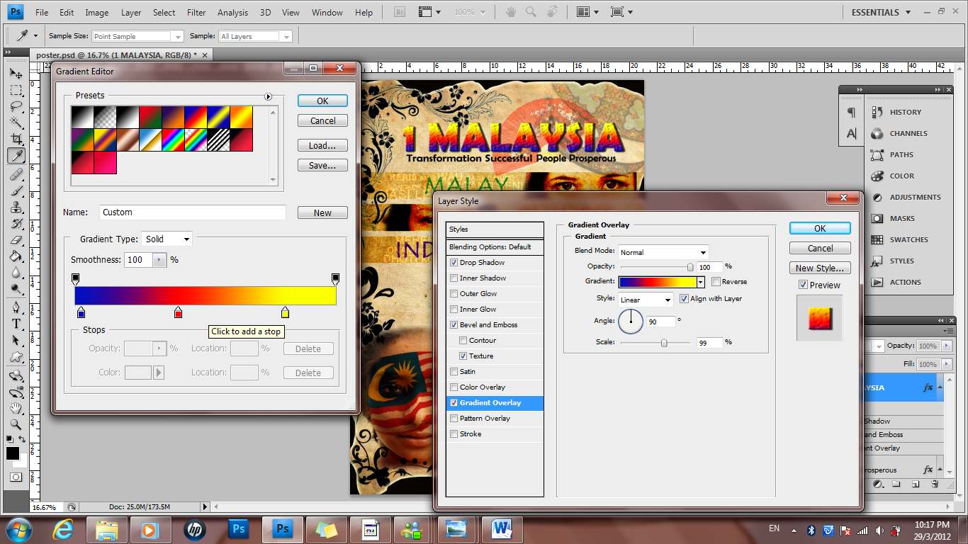
16. Then, I using Gradient editor to adjust the color of "1 MALAYSIA"

17. Last, type some words in the background to make it more interesting..
(some characteristic of Malaysia)
This is the link of my moving poster : http://mmlscyber.mmu.edu.my/Contents/MCC0033/MCC0033/NAssignment/Student/1112700681PATRIOTISM_2.swf
1st draft should show your digital poster in Flash. Good description on the making process of your poster in Photoshop and Illustrator.
ReplyDeleteI hope to see your making process in Flash! You should label your 1st draft, 2nd draft and then Final accordingly. Also, you should show the movie files for draft 1, 2 & final at your blog.
You've indeed made improvement. Make sure you documented your work for your future use.
DeleteYour Draft 2 showed at MMLS:
http://mmlscyber.mmu.edu.my/Contents/MCC0033/MCC0033/NAssignment/Student/1112700681PATRIOTISM_2.swf
You should provide movie files so that it can be viewed at your blog.
ok, thanks mdm's advice =) I had change some improvement in my blog =)
ReplyDelete